Search
result
Atlas Copco
Brand identity manual
New and updated sections
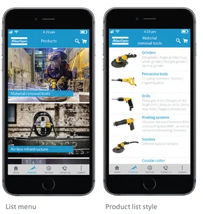
Apps
Mobile apps are common today and widely used. It is important that our visual identity is applied in all Atlas Copco apps. Use the building blocks of the visual identity relevant for the specific app.
Visual guidelines
Blue should always be the dominant color of the app design, specifically to be used for the header and launch pages. To contrast the blue header, a gray bottom menu is recommended (if bottom menu is used).
Use images and graphics extensively for a visually appealing appearance and easy navigation. The logotype placement should always be at the top left in the header with half the free space as per digital guidelines.
For typeface, use our digital font Source Sans Pro in dark gray to ensure maximum visibility.
Examples of app UI

For guidance and support:
Contact Web Competence Group via Service Desk Digicom