Search
result
Atlas Copco
Brand identity manual
New and updated sections
Typefaces
Typefaces are important elements of the visual identity. Consistent use of our typefaces reinforces our brand identity. Our typefaces are Neue Frutiger World, Source Sans Pro and Calibri and can be used depending on the medium. Neue Frutiger World is used in all printed material. For websites and digital platforms, we use Source Sans Pro. For office documents and PowerPoint presentations, we use Calibri.
Headlines:
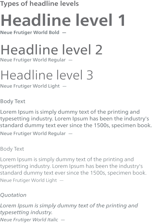
All headlines are in bold. The headlines are in sentence case, which means that you should use uppercase only for the first letter in each sentence both in headlines and in the body text. For main headlines (level 1) of printed material, use Neue Frutiger World Bold.
Body text:
For print use Neue Frutiger World Regular or Light.
Typefaces for print
Our typeface for printed material is Neue Frutiger World. The Neue Frutiger World typeface collection is an expansive family of fonts that supports more than 150 languages and scripts, including Latin, Greek, Cyrillic, Georgian, Armenian, Hebrew, Arabic, Thai, and Vietnamese. For Chinese, Japanese and Korean, we use Noto Sans CJK SC (simplified Chinese) and Noto Sans CJK TC (Traditional Chinese), Tazugane Info (Japanese), Seol Sans (Korean).
Font: Neue Frutiger World
Usage: Printed commercial material
(Brochures, advertisements, posters and more)
Types of headline levels
Typefaces for Chinese, Japanese, Korean and Arabic
When handwriting is needed
Link to download typefaces in the Communication Forum:
Download