Search
result
Atlas Copco
Brand identity manual
New and updated sections
Colors
Our color palette has 13 colors – 2 primary colors and 11 complementary colors.
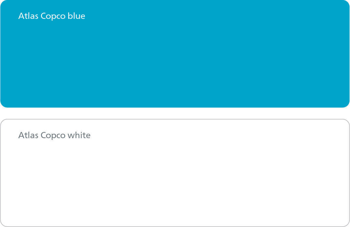
Primary colors
Our primary colors are Atlas Copco blue and Atlas Copco white. They are the most important colors in our visual identity, and either the blue or the white should be the dominant color in all our communication material and other visual applications of the brand.
Complementary colors
The complementary colors should be used to add extra creativity and spice to the communication material. Use them extensively but ensure they do not overpower the dominant colors.
Complementary colors are not to be used on high-visibility brand carriers (such as covers, landing pages, banners and billboards).
A specified tint per complementary color is allowed for digital media when used in
combination with its main color.